Customize Azure Monitor Dashboard visuals
Visuals are essential part of any Azure Monitor Dashboard. This document details the different visual types and describes various options that are available to dashboard users to customize their visuals.
[!NOTE] Visual customization is available in edit mode to dashboard editors.
Prerequisites
Visualize data with Azure Monitor dashboards
Types of visuals
Azure Monitor Dashboards supports several different types of visuals. This section describes the different types of visuals and the data columns needed in your result set to plot these visuals.
Table
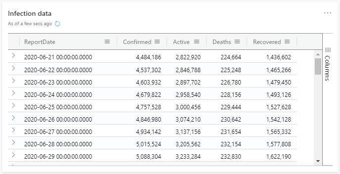
By default, results are shown as a table. The table visual is best for presenting detailed or complicated data.
Bar chart
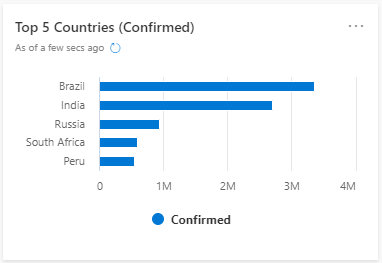
The bar chart visual needs a minimum of two columns in the query result. By default, the first column is used as the y-axis. This column can contain text, datetime, or numeric data types. The other columns are used as the x-axis and contain numeric data types to be displayed as horizontal lines. Bar charts are used mainly for comparing numeric and nominal discrete values, where the length of each line represents its value.
Column chart
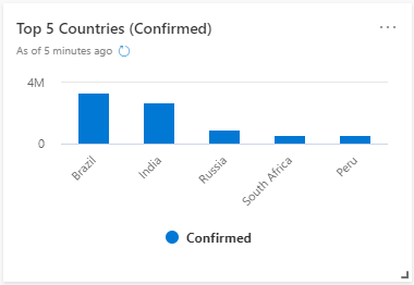
The column chart visual needs a minimum of two columns in the query result. By default, the first column is used as the x-axis. This column can contain text, datetime, or numeric data types. The other columns are used as the y-axis and contain numeric data types to be displayed as vertical lines. Column charts are used for comparing specific sub category items in a main category range, where the length of each line represents its value.
Area chart
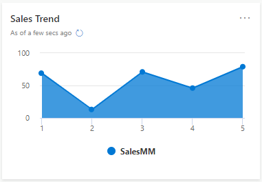
The area chart visual shows a time-series relationship. The first column of the query should be numeric and is used as the x-axis. Other numeric columns are the y-axes. Unlike line charts, area charts also visually represent volume. Area charts are ideal for indicating the change among different data sets.
Line chart
The line chart visual is the most basic type of chart. The first column of the query should be numeric and is used as the x-axis. Other numeric columns are the y-axes. Line charts track changes over short and long periods of time. When smaller changes exist, line graphs are more useful than bar graphs.
Stat
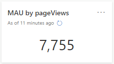
The stat visual only shows one element. If there are multiple columns and rows in the output, stat shows the first element of the first column. Stat cards are useful to highlight KPIs on the Dashboard.
Multi Stat
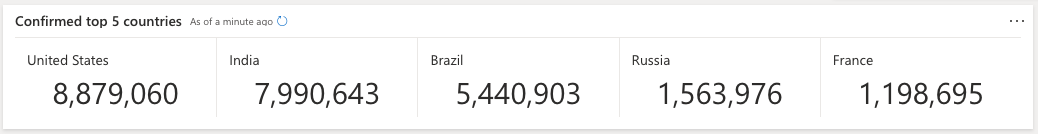
The multi stat visual shows multiple stat cards in a group using a single query result. This requires 2 columns, one for the label and the other for the value. Users can use a visual formatting option to customize the the output layout for display by selecting the number of rows and columns. In addition to being more convenient, this formatting option will reduce cluster load where customers are using similar queries to build multiple stats.
Pie chart
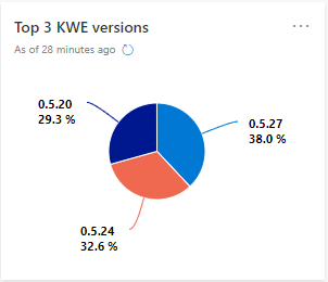
The pie chart visual needs a minimum of two columns in the query result. By default, the first column is used as the color axis. This column can contain text, datetime, or numeric data types. Other columns will be used to determine the size of each slice and contain numeric data types. Pie charts are used for presenting a composition of categories and their proportions out of a total.
Scatter chart
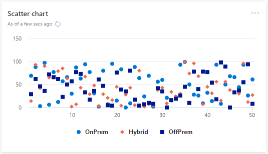
In a scatter chart visual, the first column is the x-axis and should be a numeric column. Other numeric columns are y-axes. Scatter plots are used to observe relationships between variables.
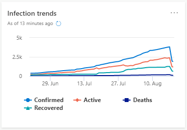
Time chart
A time chart visual is a type of line graph. the first column of the query is the x-axis, and should be datetime. Other numeric columns are y-axes. One string column values are used to group the numeric columns and create different lines in the chart. Other string columns are ignored. The time chart visual is similar to a line chart except the x-axis is always time.
Anomaly chart
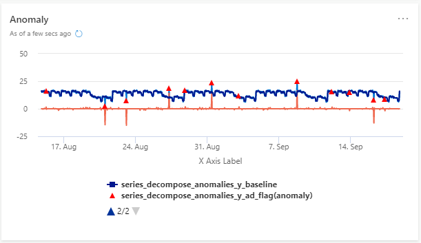
An anomaly chart visual is similar to time chart, but highlights anomalies using the series_decompose_anomalies function.
Map
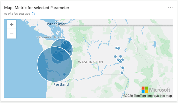
To render the map visual, four columns are needed in the query:
- String (first column) used for hover label
- Longitude (real)
- Latitude (real)
- Bubble size (int). This column can be constant one if different sizes aren't required.
Maps are useful to visualize data with geo coordinates. The Map visual also has a built-in zoom functionality.
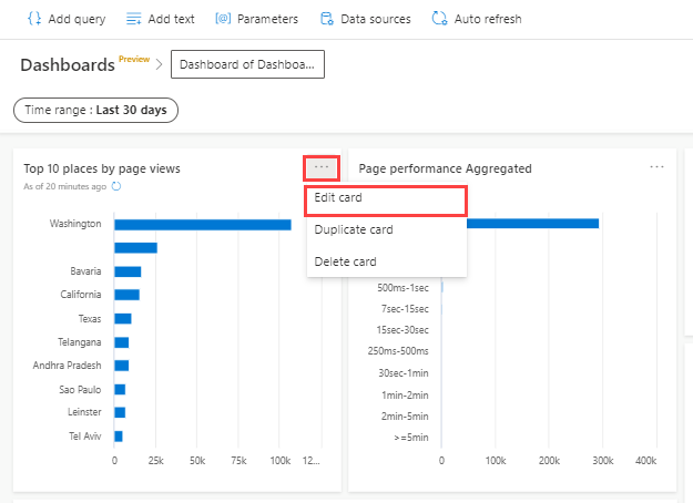
Customize visuals
- Select Edit in dashboard menu to switch to edit mode.
- To access the visual customization dialogue on a card, click the drop-down menu > Edit Card. Alternatively, when you create a new card using Add Query, select Edit Card.
Select properties to customize visuals
Use the following properties to customize visuals.
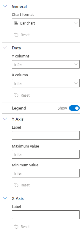
| Section | Description | Visual types |
|---|---|---|
| General | Select the stacked or non stacked chart format | Bar, Column, and Area charts |
| Data | Select Y and X Columns for your visual. Keep the selection as Infer if you want the platform to automatically select a column based on the query result | Bar, Column, Scatter, and Anomaly charts |
| Legend | Toggle to show or hide the display of legends on your visuals | Bar, Column, Area, Line, Scatter, Anomaly, and Time charts |
| Y Axis | Allows customization of Y-Axis properties:
|
Bar, Column, Area, Line, Scatter, Anomaly, and Time charts |
| X Axis | Allows customization of X-axis properties:
|
Bar, Column, Area, Line, Scatter, Anomaly, and Time charts |
| Layout | Select the layout configuration for multi stat visual.
|
Multi stat |